
Pot Light Colour Temperature Guide
Choose a white-light appearance that supports the room, materials and connected spaces while keeping colour rendering and dimming in view.
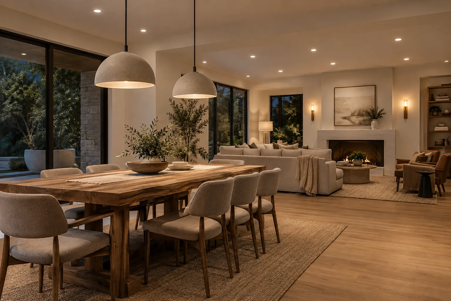
Kelvin describes appearance, not brightness
Colour temperature describes whether white light appears warmer or cooler. It does not tell you how bright a fixture is, how accurately it renders colour or how comfortable its aperture will look. Two 3000K fixtures can differ significantly in output, beam shape, glare and colour quality.
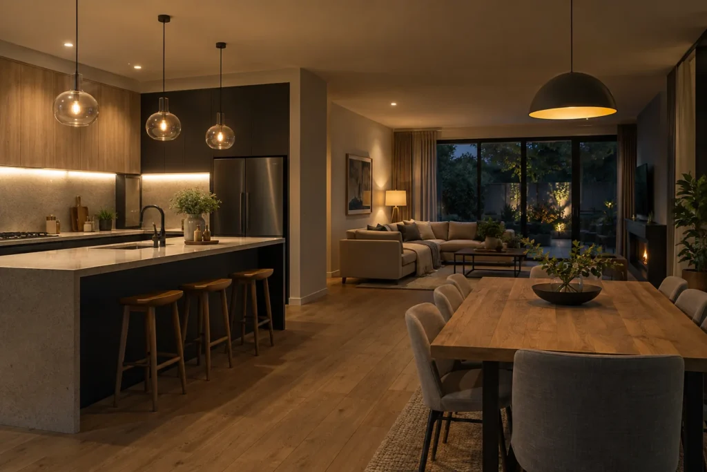
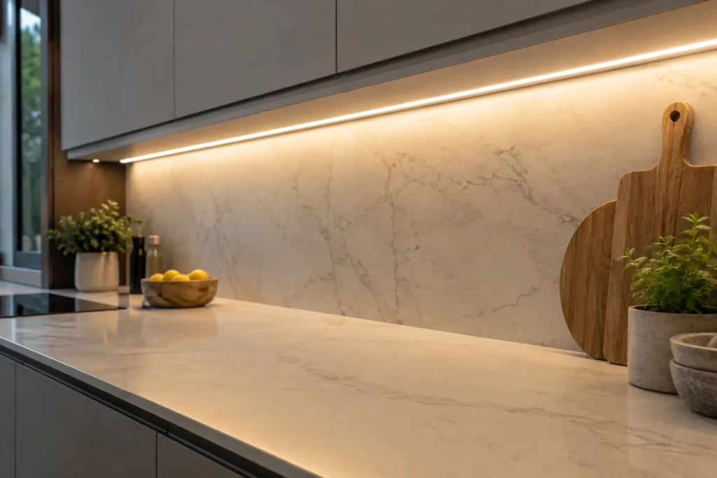
The number is most useful when it is compared across all visible light sources. Pot lights at 3000K can look disconnected beside much warmer cabinet lighting or a cooler vanity fixture. A consistent base temperature usually produces a calmer result in connected rooms.
- 2700K reads warm and relaxed.
- 3000K is warm-neutral and versatile.
- 3500K sits between residential warmth and crisp neutrality.
- 4000K reads neutral-white and more alert.
- Brightness, CRI and beam spread are separate decisions.
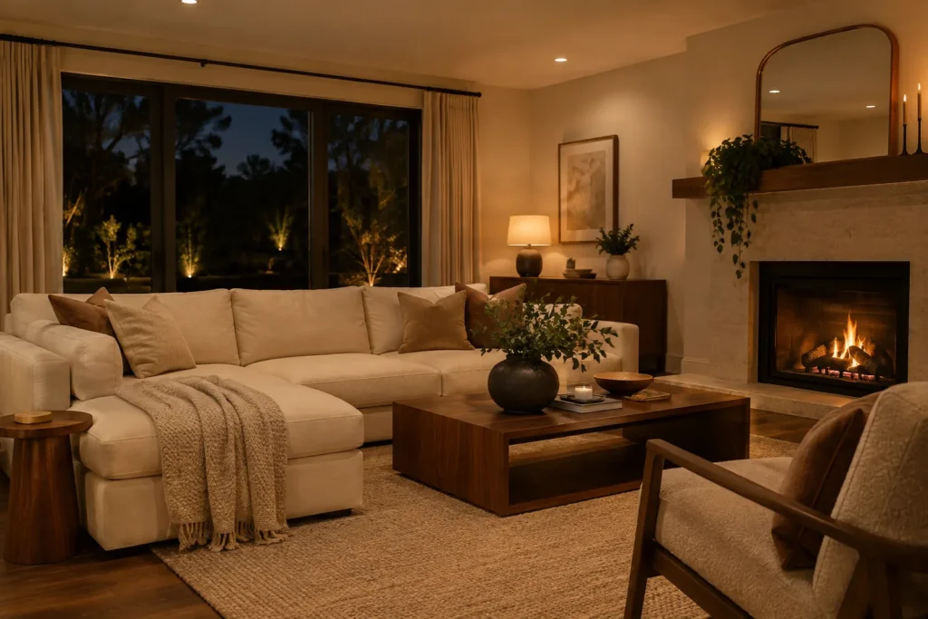
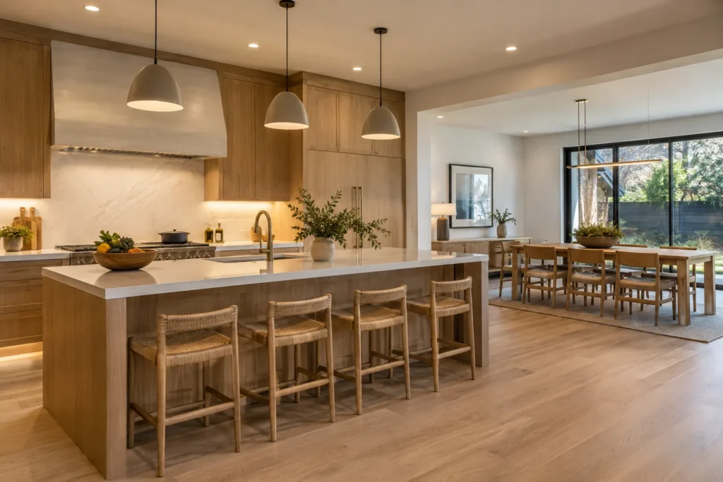
2700K for softness and evening comfort
2700K often suits living rooms, bedrooms and traditional interiors where lamps and warm materials are prominent. It can make wood, warm textiles and evening scenes feel comfortable. In a bright white kitchen, however, it may appear noticeably amber beside daylight or cooler task lighting.
Use it deliberately rather than automatically. A bedroom may benefit from warm downlights, while an adjacent ensuite at 4000K can create an abrupt transition. The full view between rooms matters as much as each room in isolation.
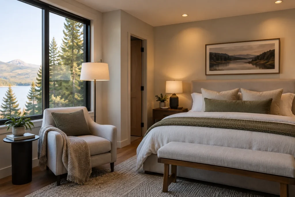
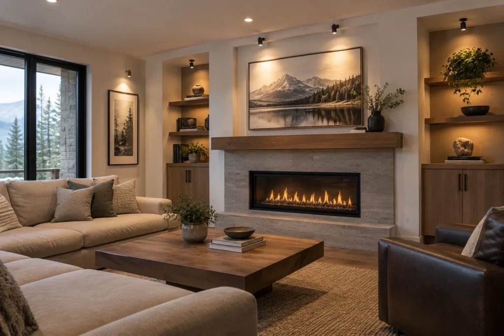
3000K as a flexible residential baseline
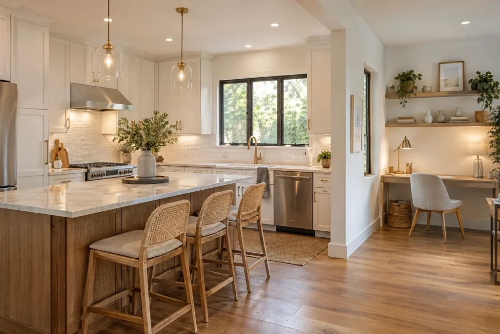
3000K is widely used in contemporary homes because it retains warmth while reading cleaner on white cabinetry and stone. It can coordinate pot lights, pendants and under-cabinet lighting across a kitchen and connected family room when the products have comparable colour quality.
That versatility does not make every 3000K product identical. LED tint can lean slightly pink, green or yellow, especially between brands. Viewing the proposed products together is more reliable than matching the printed Kelvin number alone.
- Kitchens and open main floors
- Living spaces with white or oak finishes
- Bathrooms where warmth is still preferred
- Exterior entries that should not look stark
- Connected rooms using several fixture types.
3500K and 4000K for a crisper appearance
3500K can be useful where a room needs a little more visual clarity than 3000K without the cooler appearance of 4000K. Home offices, workrooms and modern kitchens may suit it when adjacent sources are coordinated. Availability varies by fixture family.
4000K can suit bathrooms, laundry rooms, workshops or commercial tasks where a neutral-white appearance is preferred. In a bedroom or warm living room, it may feel too cool. The decision is aesthetic and functional; a higher Kelvin number does not create more lumens by itself.
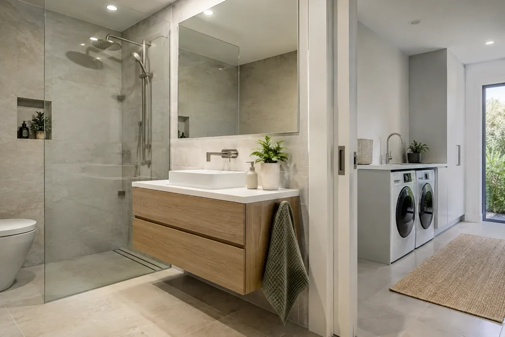
CRI and colour quality
Colour rendering describes how faithfully a light source reveals colours compared with a reference. A higher general CRI is useful, but saturated red performance and overall spectral quality can also matter in kitchens, wardrobes, bathrooms, art and finish selection. Product data should be reviewed rather than relying on marketing labels.
Good colour rendering helps food, wood, paint and skin tones appear natural. It does not correct poor placement. A high-CRI pot light behind a person at the counter can still produce an unhelpful shadow on the work surface.
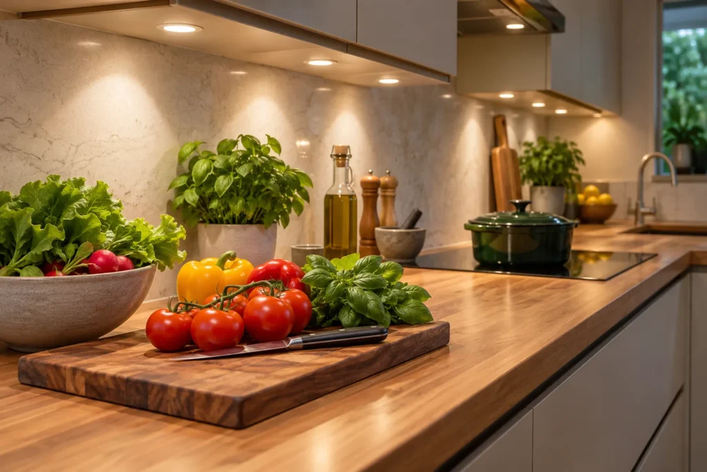

Mixing temperatures in connected spaces
Deliberate contrast can work, such as warmer decorative lamps within a 3000K general-light layer. Accidental contrast looks different: one cabinet run appears yellow, an island appears white and the hallway appears blue. Connected sightlines should be reviewed from normal seating and entry positions after dark.
Selectable-colour fixtures can simplify purchasing, but every unit should be set consistently before installation is complete. Record the chosen setting. If future replacements are needed, match the visible result rather than assuming the switch label tells the complete story.
Dimming changes perception
Many fixed-white LEDs maintain roughly the same colour appearance as they dim, even though people associate lower light levels with warmer evening light. Warm-dim products intentionally shift warmer at lower output. Both approaches can be successful when they are chosen consistently and paired with a compatible dimmer.
Test the usable range. Smooth behaviour at ten or twenty percent may matter more in a bedroom or living room than the maximum output. Watch for flicker, stepping, delayed start, drop-out and inconsistent low levels between fixtures.
Apply pot light colour temperature guide to the actual property
A guide is most useful when it produces a short list of facts to verify. Measure the room or exterior area, record ceiling height, identify the surfaces and activities that need light, and photograph the complete setting from normal viewpoints. Include existing fixtures, switches, vents, bulkheads, cabinetry and any safely accessible unfinished space. Those details make product and route discussions specific without pretending that photographs reveal concealed conditions.
Separate decisions into three groups. First are visible outcomes: where light should land, how bright the area should feel and which fixtures should be visually quiet or decorative. Second are installation conditions: framing, wiring, boxes, support, exposure and access. Third are operating choices: switching zones, dimming, sensors, schedules and connected features. A complete scope addresses all three instead of reducing the project to a fixture count.
Review the proposal from normal standing and seated positions, not only from directly below a fixture. A ceiling arrangement can look orderly while missing a counter, producing television glare or making a bright aperture conspicuous over a bed. Exterior positions also need views from the property edge, driveway and neighbouring directions. These observations translate general guidance into useful location priorities.
Ask the written quote to name the proposed products, quantities, control devices, access assumptions, protection, cleanup, notification handling and exclusions. Where a route or support condition cannot be verified in advance, the quote should explain how a change is assessed and approved. Drywall finishing, painting, cabinetry, structural work and other trades should be identified clearly rather than assumed.
After installation, review output, glare, dimming and control operation in the conditions where the lighting will be used. Exterior aiming should be checked after dark from the property edge and neighbouring directions. Keep the layout, product model numbers, colour settings, control data and any Certificate of Acceptance with the property records so future service does not begin from guesswork.
- Verify the room, target surfaces and ceiling height.
- Match product data to the exact location.
- State concealed-condition and finish assumptions.
- Confirm the Licensed Electrical Contractor responsible for electrical work.
- Retain the final product, control and acceptance records.
Pot Light Colour Temperature Guide FAQs
Is 3000K or 4000K better for a kitchen?
Neither is universally better. 3000K gives a warmer residential appearance; 4000K looks crisper. Cabinet colour, connected rooms, task preference and the colour of pendants and cabinet lighting should guide the choice.
Does 4000K produce more light?
Not necessarily. Kelvin describes white-light appearance. Brightness depends on lumen output, beam spread, room surfaces and fixture placement.
What colour temperature suits a bedroom?
Many bedrooms suit 2700K or 3000K because those temperatures support a softer evening mood. Placement and dimming remain just as important as the Kelvin number.
Can I mix 2700K lamps with 3000K pot lights?
Yes, if the contrast is intentional and visually comfortable. Accidental mixing across fixed fixtures usually looks less coherent.
What does CRI add to the decision?
CRI provides information about colour rendering. Higher-quality light can make food, finishes, clothing and skin tones look more natural, but it must still be placed and controlled well.
Plan the lighting around the space—not a generic grid.
Share the room or exterior area, ceiling height, current lighting, preferred fixtures and any photos that show access conditions. That information makes the first conversation more useful.